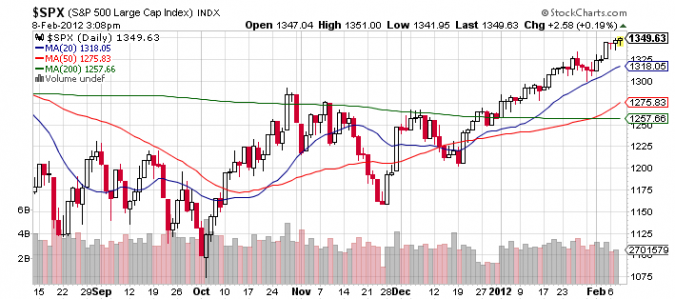
Time to take a look again at the technical picture of the S&P 500 Index, which seems to be in a nice uptrend, undeterred from anything:
If only the volume was increasing (usually, higher prices are met with higher volumes as more investors are willing to part with their shares and buyers have to “eat” through their offers).
Stocks can trade above or below their moving averages. One thing is sure: they always come back to their average (or the average follows). The more stocks are trading above their average, the stronger the trend. However, this cannot go on for eternity, and gravity eventually sets in.
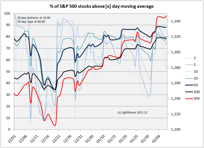
We measure the percentage of stocks within the S&P 500 Index (red) trading above their averages of the past 3, 5, 10, 20, 50 and 200 trading days (various shades of blue). The current data:
Moving average / % above (maximum since 8/2010)
3 day: 50% (98%)
5 day: 73% (99%)
10 day: 77% (98%)
20 day: 81% (96%)
50 day: 88% (94%)
200 day: 79% (94%)
The combined chart looks like this:
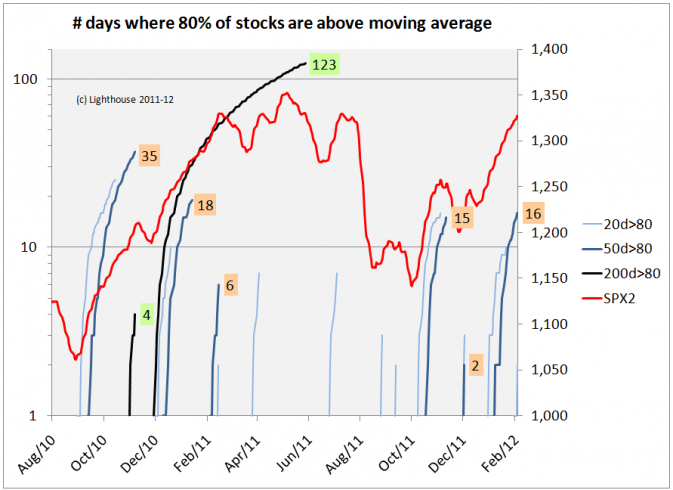
You can also measure the number of days these indicators (20, 50 and 200 days) remain above a certain level (80% or 90%). This gives a feeling for the “aging” of a rally:
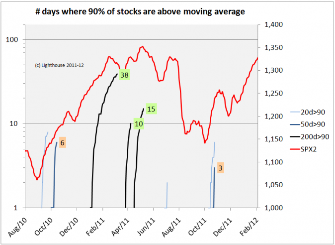
And same for 90 days:
You can picture these lines like thin plants, growing longer and longer until a big wind pushes them over. The longer they grow, the more susceptible they are of being blown down. But if no storm happens, they keep growing. I gave the “plants” 5 days of “growing pause” (when they briefly dip below 80% or 90%) before I reset the counter to zero.
The number of days where 80% of stocks are above their 50-day moving average (upper of the two charts, medium blue lines) usually ends when the “plant” reached between 15 and 35 days. The current plant is 16 days old.
There is also a black plant (days where 80% or 90% of stocks are above their 200-day moving average). It is a rare plant, growing only in very strong bull markets (like September 2010 to April 2011). So far no “black plant” has been sighted. This serves as a warning that the current bull market could in fact run much further than most people (including me) anticipate.
On the other hand, “black plants” have usually “died” before the bull market dies.
The reason you might have never heard of this indicator is because I just invented it. A bit nerdy, but helps visualizing the age and stage of bull markets. Back to more “traditional” measures:
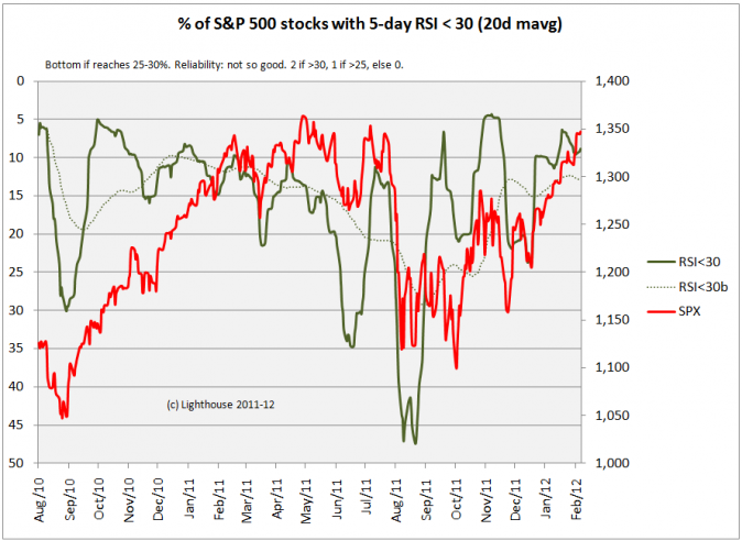
Percentage of stocks with RSI (relative strength index) below 30:
The current reading of 9% is pretty low (min-max = 4%-47%). The market is definitely not oversold.
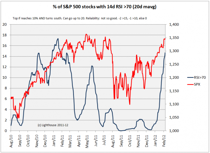
Now to the opposite: percentage of stocks with RSI over 70:
The index is approaching its all-time record (17). This does not mean the market will crash (see November 2010), but that it is at least prone for a pullback.
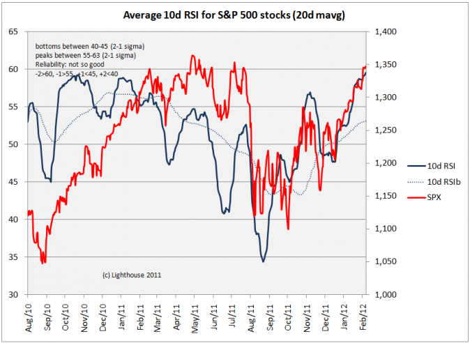
Next up is the average RSI of all stocks in the S&P 500 Index:
The current reading is at record high (60%). Doesn’t mean the market cannot go higher, but the air is getting thinner.
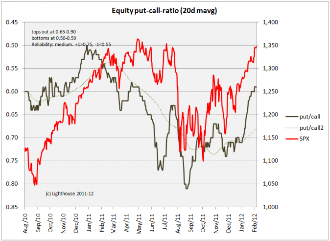
Next: the famous put-call ratio (here: equity options only, 20-day moving average):
The current value of 0.59 I would grade as neutral to slightly bullish (the more calls relative to puts are being traded, the more bullish investors are). Inconclusive (since not at an extreme).
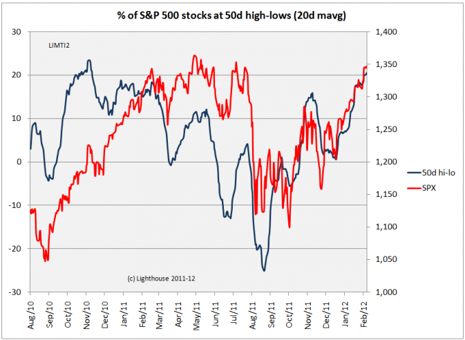
Stocks making new 50-day highs are a good sign. However, if there are too many, it is a counter-indicator. Subtracting the percentage of stocks making new lows from the number of stocks making new highs delivers the following chart:
The current value of +20 is close to the record (+23) and can be considered “ripe for a correction”.
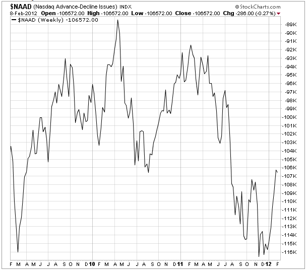
Moving on to the Nasdaq Advance-Decline-Line (cumulative difference between rising and falling stocks):
The Advance-Decline-Line does not confirm the recent 52-week high marked by the Nasdaq index, which is usually a worrying sign (few stocks are carrying the index higher while the majority of stocks is not following). There is no classic divergence yet (where index rises and AD-line falls, but it should be watched.
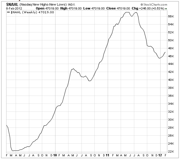
The Nasdaq new highs/new lows index has not confirmed a bull market until the beginning of the year, as it continued to decline while stock prices rose:
This is the single-best indicator I have come across, and I am worried (about our short positions) since it has recently turned positive.
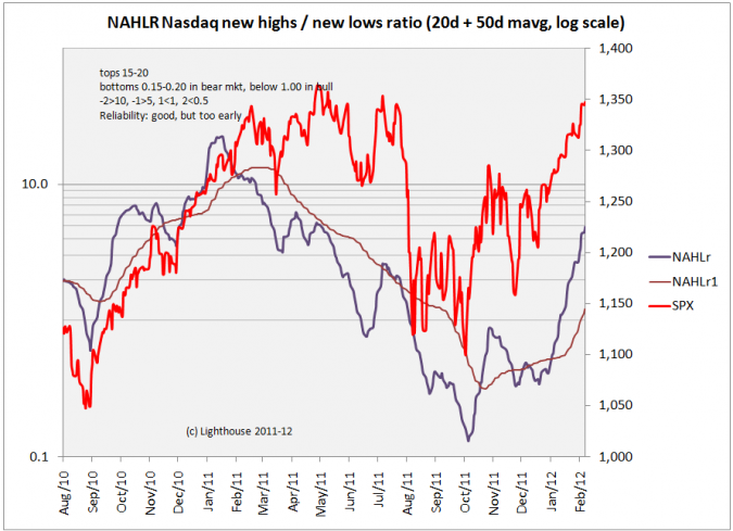
A different way of looking at new highs versus new lows is to calculate the ratio between the two:
The ratio currently stands at 5, so still has room before reaching its former maximum (22). It indicates the uptrend being intact, but might run out of steam in 4-8 weeks.
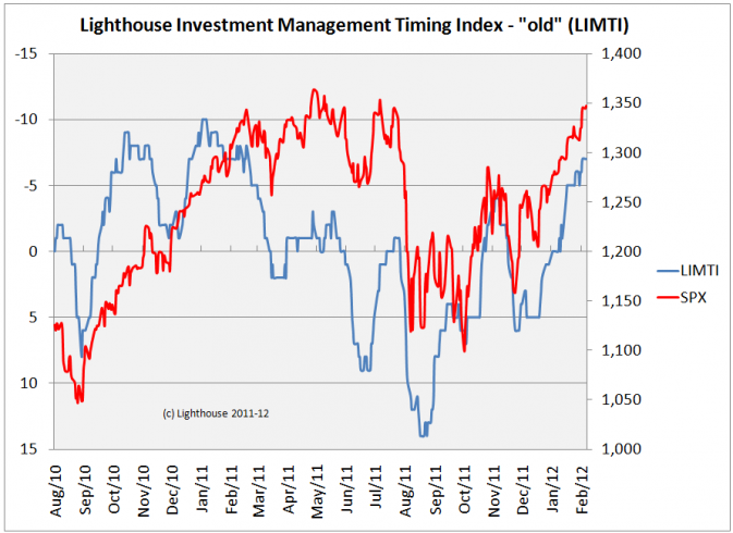
After applying standard deviation analysis to each indicator and weighing them by how well they have historically done we get the following “old” LIMTI (Lighthouse Timing Indicator):
The current reading of -7 is pretty close to its worst level (-10) and indicates danger of a pull back.
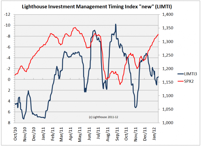
However, the “new” Lighthouse Timing Index is in neutral territory. It uses deviation from moving averages, but has not “behaved” well since August 2011. I might have to fine-tune it again:
Index history currently goes back only 18 months as the data collection is pretty time-intensive. It is still work in progress.
CONCLUSION:
The current market is short-term trading in thinner air, but it doesn’t look like the medium-term uptrend is about to end.
I will look at sentiment indicators next in order to decide if short positions have to be reduced (or mitigated via call options).

