The efficacy of both technical and fundamental analysis is disputed by efficient-market hypothesis (which states that stock market prices are essentially unpredictable). If stock prices were unpredictable, my clients would be wasting money.
“Technical analysis” tries identify patterns that help determine future prices. You might ask “how can a formula know what happens in the future”? That is a good question. I don’t think such formula exists. However, it is not the event, but rather the stock market reaction to it that counts.
Example: usually the onset of war is a bad event for stock markets. The invasion of Kuwait by Iraq in 1990 let to the build-up of Operation Desert Storm. Global stock markets anticipated a war and sold off quite dramatically. But when fighting finally began on January 17, 1991, stock markets “exploded” to the upside; the S&P 500 index rose from 316.17 (January 16) to 332.23 (January 18) and later on to 370.47 (March 1), an increase of 17%.
There seem to be situations where investors “anticipate” events and where rational behavior (sell when war breaks out) might lead to irrational results (miss a stock market rally).
Now on to technical analysis.
You can measure multiple things that make sense. For example, you could look each day how many stocks rise versus how many decline, and add the difference to an arbitrary starting point (i.e. 10,000). It would look like this:
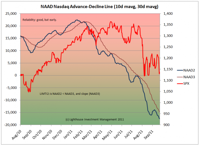 I prefer Nasdaq since there are less fixed-income related listings (that have nothing to do with the stock market and could distort the result). The blue line is a 10-day moving average (mavg) (to iron out daily noise). The brown line is a 30-day mavg of the blue line to determine the trend. A rising line means: on average, more stocks are rising than falling. This is important for the markets “breadth”. A thin breadth means that the major stock market indices are still rising (or falling), but driven by only a few stocks (while the majority already moves in the other direction).
In the above chart you see the advance-decline line peaking in early 2011. That is when the overall stock market (red line) entered a sideways pattern. The sell-off in August was accompanied by further decline in the advance-decline line. This is a confirmation of the trend.
You can use this information for a timing indicator. I give positive points for a positive slope of the 30-day mavg (rising) and for times where the blue line is above the brown line.
This, of course, is only one indicator.
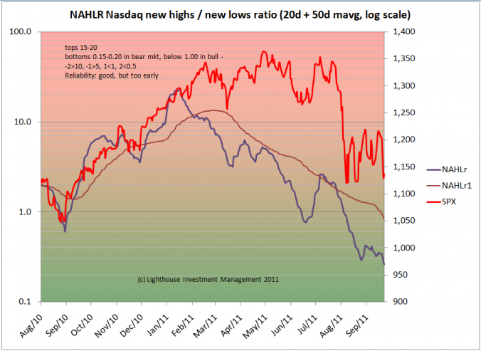
A slight variation of the advance-decline line look at the daily ratio of stocks making new 52-week highs divided by number of stocks making new 52-week lows. Those numbers “flutter” a lot, so you need longer moving averages (20 and 50 days) to get the noise out. It is a similar picture:
I include the slope of the brown line (positive = good) in our timing indicator.
Better yet from a timing prospective seems to be the following indicator: each day, we look at the number of stocks making new 52-week highs and new 52-week lows and add the difference to an arbitrary starting number:
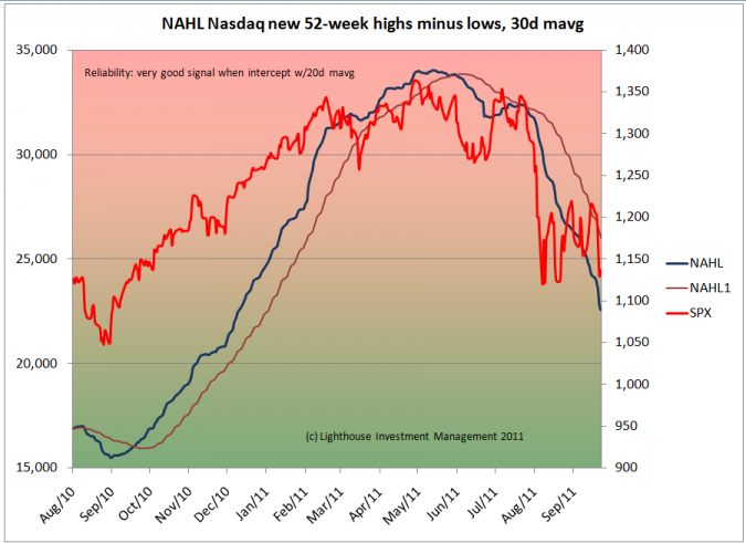 The blue line does not need any “smoothing” and peaks pretty much at the same time as the stock market. I use a 30-day mavg as a “trigger” line, awarding positive points for positive slope and for the blue line being above the brown line.
There are other indicators which are a bit more problematic, because they can have their own trend. It is hence impossible to say that a reading of X is overbought or oversold. One remedy is to lay a trend line (moving average) through the indicator, then calculate the difference of the indicator to its trend line:
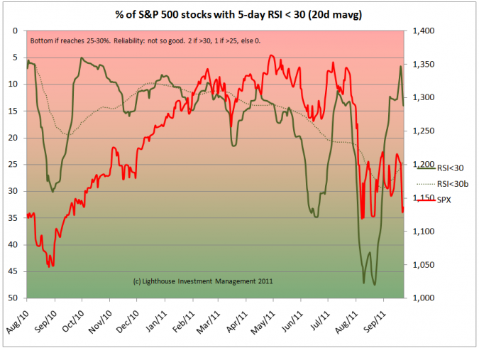 Above you see, in bold green, a 20-day mavg of the percent of stocks within the S&P 500 index trading at a 5-day relative strength index (RSI) of less than 30. It bottoms at 30 in August 2010, but at 47 in August 2011 (left hand scale is inverted). So we have to lay a trend line (dotted green) and calculate the difference:
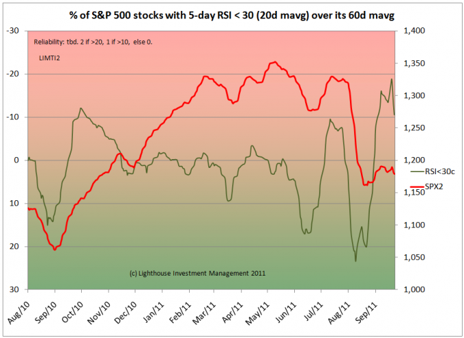 I chose a 60-day mavg for the trend line (= 3 calendar months with 20 trading days each) since the market seems to have a certain pattern of peaks and bottoms every 3 months (peak in November 2010, February 2011, May 2011, August 2011).
This indicator seems to give a false signal at big trend reversals (September 2010), but is pretty good at signaling swings in a sideways market. Interestingly, the measure gave a big alert to sell during the meager recovery of the S&P 500 index in September.
Another indicator needing trend adjustment is the put-call ratio (number of put option contracts traded divided by number of call options traded):
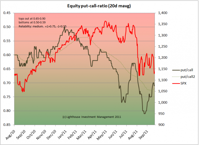 Even the trend-adjusted indicator has its limitations, and hence gets a low weighing in the overall timing indicator.
For short-term timing purposes I find the following indicator useful:
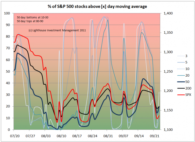 Basically, you measure the percentage of stocks within the S&P 500 index trading above their own moving averages. You chose different periods (3, 5, 10, 20, 50 and 200 days), and the above chart is what you get.
You will realize the short-term indicators move faster and are more volatile than the longer-term ones. But it seems that when all of the indicators are near zero (for example around August 10th) the stock market (red line) “cannot” go much lower. Conversely, when most indicators are at high levels (July 20), the stock market is likely to go down.
You can get a bit more order into that “spaghetti” chart by averaging those indicator in three groups: short (3, 5 days), medium (10, 20 days) and long term (50, 200 days):
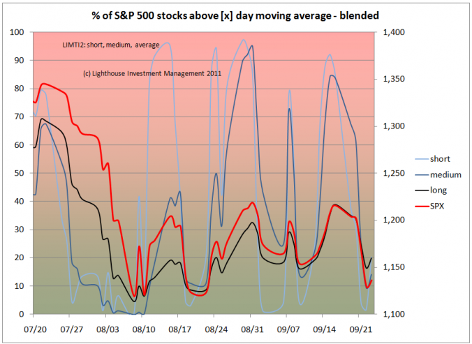 Or even average them into just one:
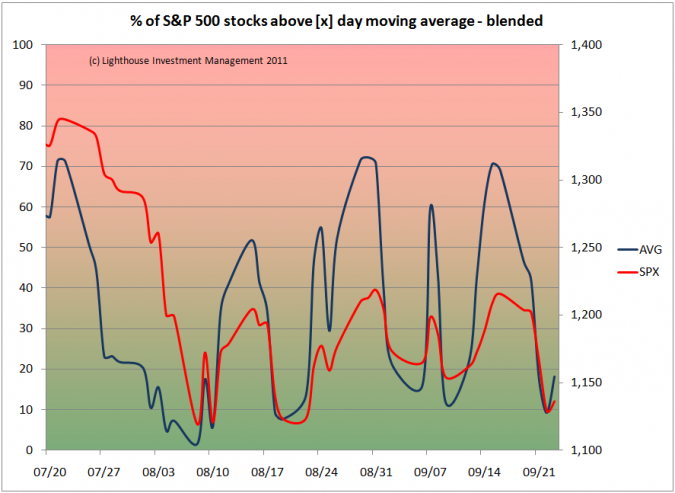 There are some more indicators I do not want to bore you with here. Assigning values for overbought and oversold conditions, then weighing the results and adding them up leads to the following “new and improved” LIMTI (Lighthouse Investment Management Timing Indicator):
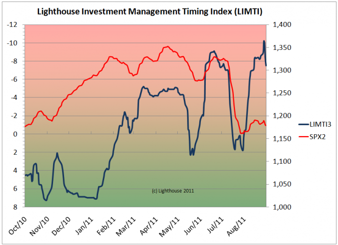 Worryingly, the indicator is showing a more overbought level than in July (before a major sell-off). This would suggest another large downwards movement in the equity market is lurking ahead.
Due to short-term “exhausted” downward momentum I could imagine the market to catch its breath for a couple of days before resuming a negative trend.
I will post updates on the “new and improved” LIMTI as well as some of the interesting sub-components.

